
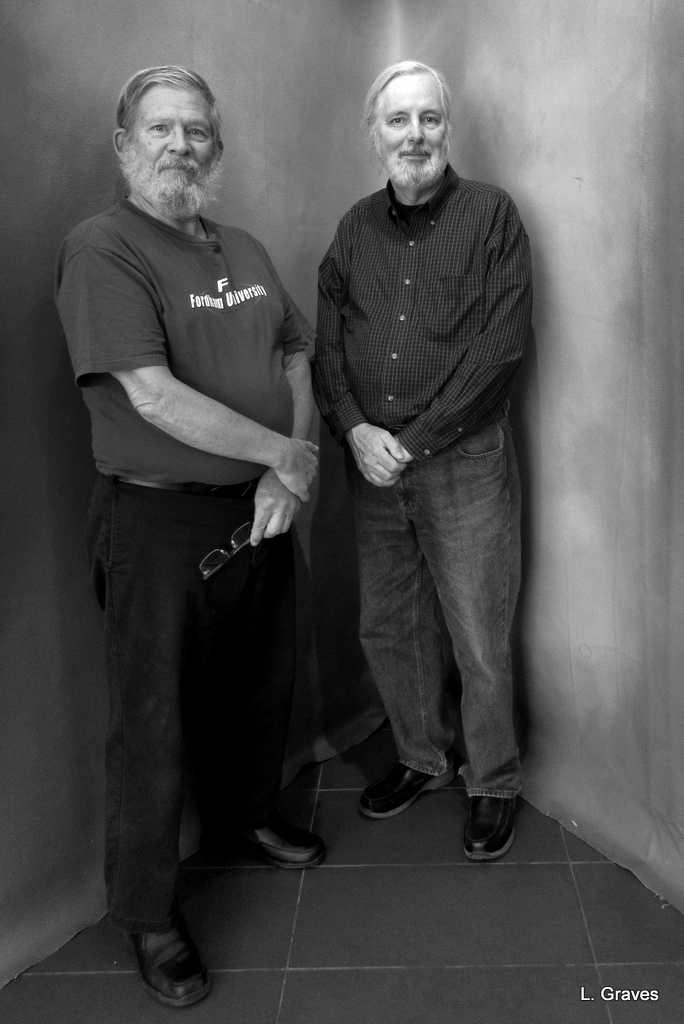
On yesterday’s post, I featured this picture of my husband, Clif, and his friend John.
My blogging friend Tialys—who, by the way, has a wonderful blog—asked, “But why are they standing in the naughty corner?” (Clif and I had a good giggle over this question.)
I had never thought of the portrait that way, but I can see Tialys’s point. John and Clif are, after all, standing in a corner. After thinking about the question, I decided that further explanation was needed.
The corner is a backdrop at the Colby College Museum of Art in Waterville, Maine, and is part of an exhibit called I Am Not a Stranger: Portraits by Séan Alonzo Harris.
Here is an explanation of the exhibit from the museum’s website:
Presented by Waterville Creates! in partnership with the Colby Museum, I Am Not a Stranger: Portraits by Séan Alonzo Harris will include approximately fifty new studio photographs of Waterville residents….This major new work by Harris, an accomplished photographer who is new to Waterville but has lived and worked in Maine for over twenty years, aims to represent the people of Waterville, build bridges across difference, and create a platform for storytelling and community reflection rooted in our shared space.
I Am Not a Stranger includes some of Harris’s portraits of Waterville residents, and if you click here, you will see selected works from the exhibit.
The gray corner was also part of the exhibit, and I asked a woman working at the reception desk if museum goers were allowed to have their pictures taken against the backdrop.
“Oh, yes!” the woman answered. “Snap away!”
Hence the portrait of John and Clif, two very photogenic guys.
The corner backdrop can be interpreted in a number of humorous ways. But it seems to me that the gray background frames the Waterville residents—and John and Clif and anyone else—in a way that gives them dignity and attention that everyday folks don’t normally receive. The backdrop guides your gaze and encourages you to look, really look, at the people in the photographs. The black and white only serves to heighten the mood.
Here is the same picture in color.
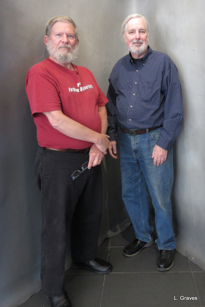
Better in black and white, don’t you think?

Funny about the naughty corner, haha 🙂 Though both versions are good, I think the B&W is better without the distractions of color.
J > Better in B&W
Yes, yes!
There’s a lot to be said for black and white. An occasional movie is filmed in b and w. Can’t think of any TV shows that do that, though.
Sure is!
Clif is never naughty, is he?
On occasion. 😉
The black and white is more atmospheric I think…and love the background story.
“Atmospheric” is a perfect description.
I like the b&w better too. It’s a classic.
Thanks, Susan.
I agree with you on the black and white option.
Somehow, it just looks better in black and white.
I definitely do think so and I reckon your photograph could hold its own in the exhibition too.
Thank you for the explanation.
Many thanks!
The pictures can be seen at other venues in Waterville such as the Alfond Child and Community Center. In some of the pictures people brought pets or objects that help to represent how they see themselves . Some people explain how they came to live in Waterville, Maine.
Thanks for letting me know. Maybe I will drop in to take a look next time I am in Waterville.
Black and White wins in my book.
Mine, too.
One of my readers transformed one of my photos to black and white, and I was astonished at the change. I tend to prefer color, but in that case — and this one — I absolutely think that black and white works better. It can make a snapshot a photograph.
Perfect description! Sometimes black and white makes a snapshot a photograph, and in this case it certainly did.
Absolutely
I knew you’d agree.
Fascinating to be able to compare the two shots and to hear the backstory. What a great project and exhibition. The b & w is defintiely better. All my focus was on those wonderful characterful faces.
Thanks, Sandra!
Honestly, the difference is amazing–the color picture is just an uninspiring snapshot (sorry!) but the b&w has gravitas and character!
So true!
I think B&W is good for portraits–and captures light differently. The lack of color makes you focus on texture and light and faces. Or line. Any way, it’s good to know the story. Waterville sounds like a place to visit!
Yes, that’s exactly right. Waterville is a great place to visit. Along with the art museum there is a cinema that shows indie movies, and there are plenty of tasty places to eat.
They do look like brothers, Laurie!
Brothers in spirit, certainly.
Two bearded men, sent to the naughty corner…. haha.
😉
Rather acute angle, if you ask me (geometric reference, but you can accept the metaphor as that seems to be purpose of the position).
Oscar
The black and white photo definitely has the edge. With their hair similar, both with beards and the hands in almost the same pose it speaks of a story behind the characters. Thanks for sharing.
My pleasure!
Thanks for the explanation, Laurie. Black and white wins for me, too.
Black and white seems to be the winner.
I don’t know, each has its good points. They do look like they were up to some mischief, but maybe that was a long time ago. Also, which one is Clif?
Yes, mischief. At any age. 😉 Clif is the one directly in the corner.
Both are good-the black and white is the favorite- sweet picture, a special one.
It really is. One to frame.
Another vote for better in black & white and thanks for including a link to the exhibit.🙂
The black & white is definitely the winner.